
Menu
‘Swaad’ – loosely translated means flavour or taste in Hindi. The name was derived from the idea of a well fed person in India complimenting the chef by saying, “Wah, kya swaad” – “What delicious flavours” during a meal being possibly one of the highest compliments a chef can receive.
We worked with the founder Bhumika Patel on the brand identity framework, naming, positioning, packaging and digital design for her ‘home-like’ catering service. Home-like food is a big part of Bhumika’s offering.
Swaad is build around that idea that food is more than just a few ingredients put together, food feels like a warm hug and a welcoming smile, sometimes it’s a forgotten memory revived by delicious flavours, and lot of times its a coming together of people to make new memories, laugh and share the joy of flavours. It’s that most special part of an event that brings people together and makes them feel at home.
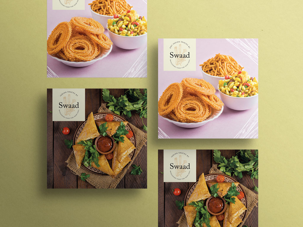
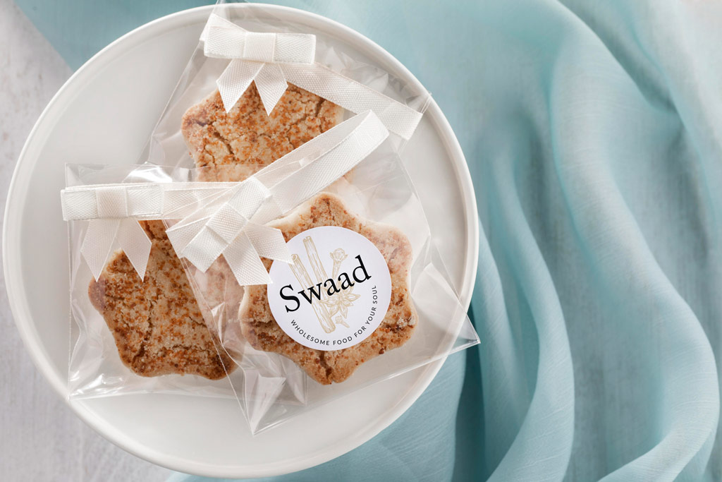
Wizdumb has created brand identity framework, naming, positioning, packaging for Swaad that honours age old home traditions (recipes and cooking techniques Bhumika swears by – spices are an integral part of Indian cooking) and at the same time blend them with contemporary visuals to feature her ever-growing skillset.
The brand identity features hand-drawn spices with a classic serif type that accentuates the homely and familiar feeling. The brand imagery is carried forward for different offerings by using a combination of hand-drawn graphics with fresh colours to give the brand a lively look.


Swaad
Brand Identity
Ramma Pande
Ramma Pande
Write to us at hey@wizdumb.in
Or give us a ring on +91 96374 35432